Posted on February 12, 2025, by Peter Loomis
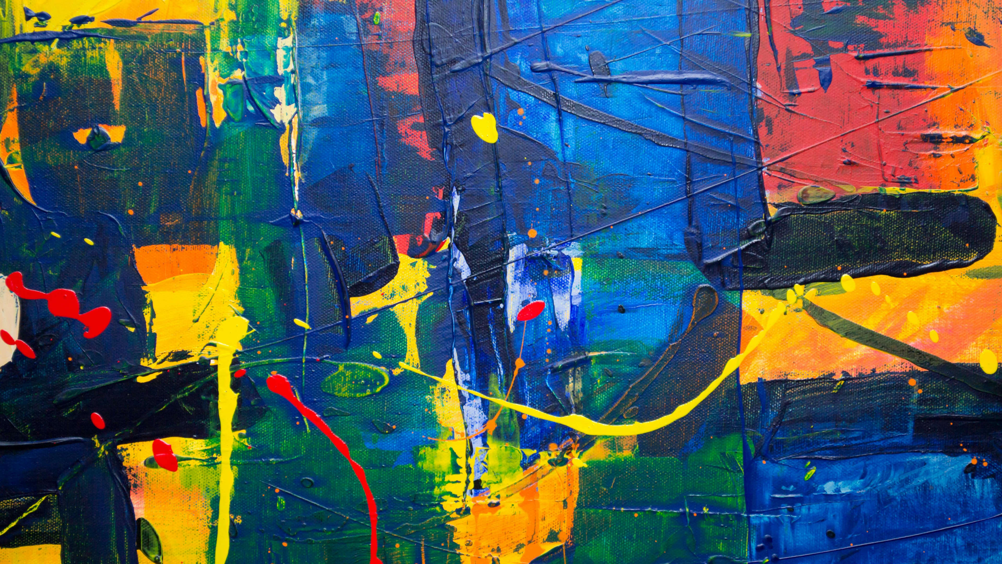
Color is one of the most powerful tools in design, influencing perception, mood, and functionality across various fields—from branding and web design to fashion, interiors, and product development. A well-crafted color palette enhances aesthetics, strengthens brand identity, and ensures consistency across different mediums.
In this guide, we’ll explore expert strategies for building a strategic, accessible, and visually appealing color palette for any design project.
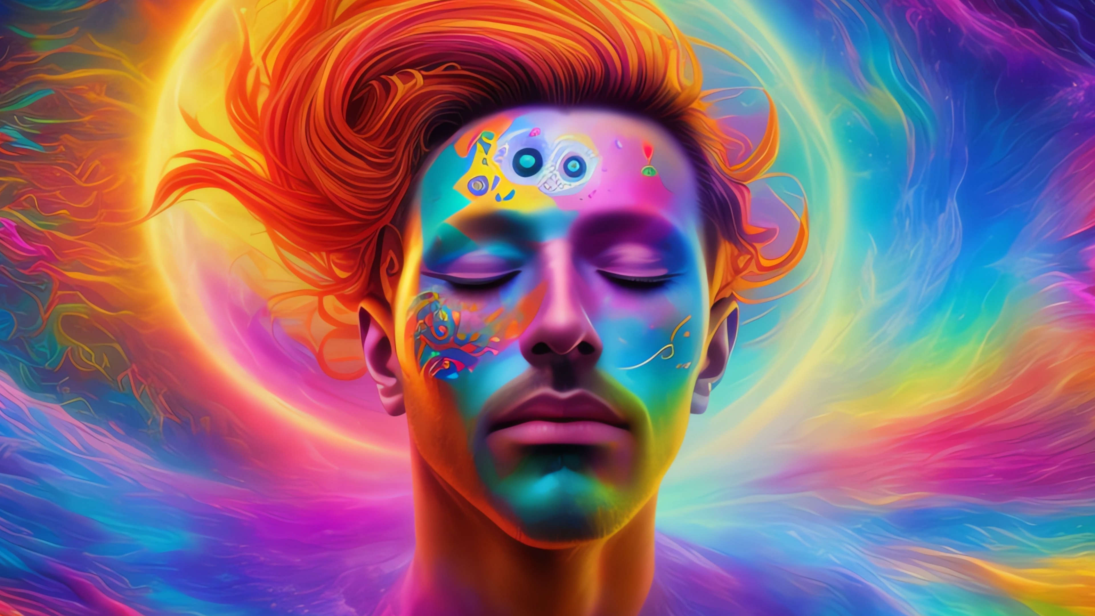
Color is more than just an aesthetic choice—it has the power to shape emotions, influence decisions, and define a brand’s identity. Whether used in branding, interior design, fashion, or digital interfaces, colors evoke specific psychological responses that can impact user behavior and engagement.
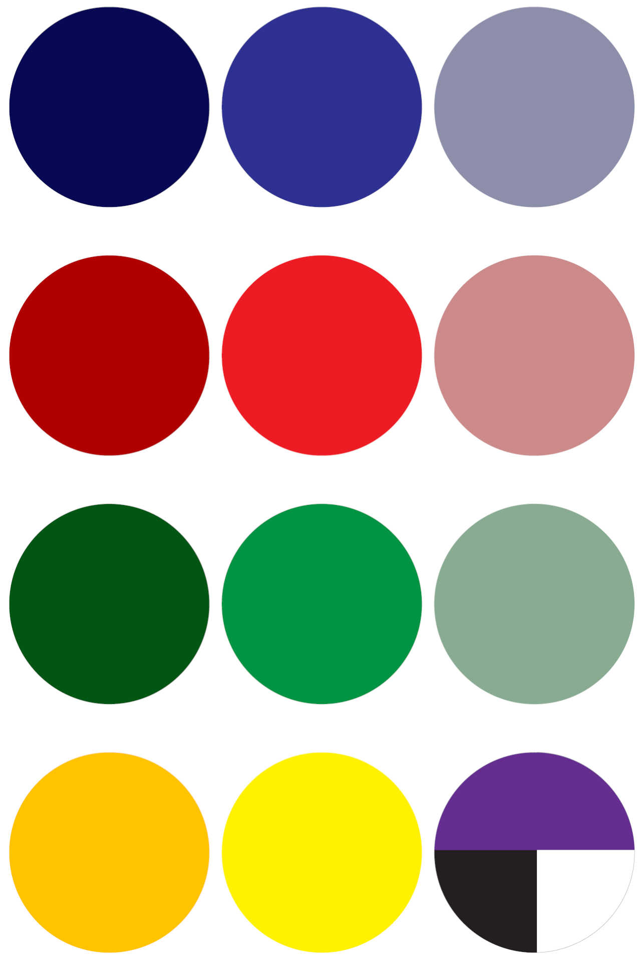
Here are some common color associations across different industries:
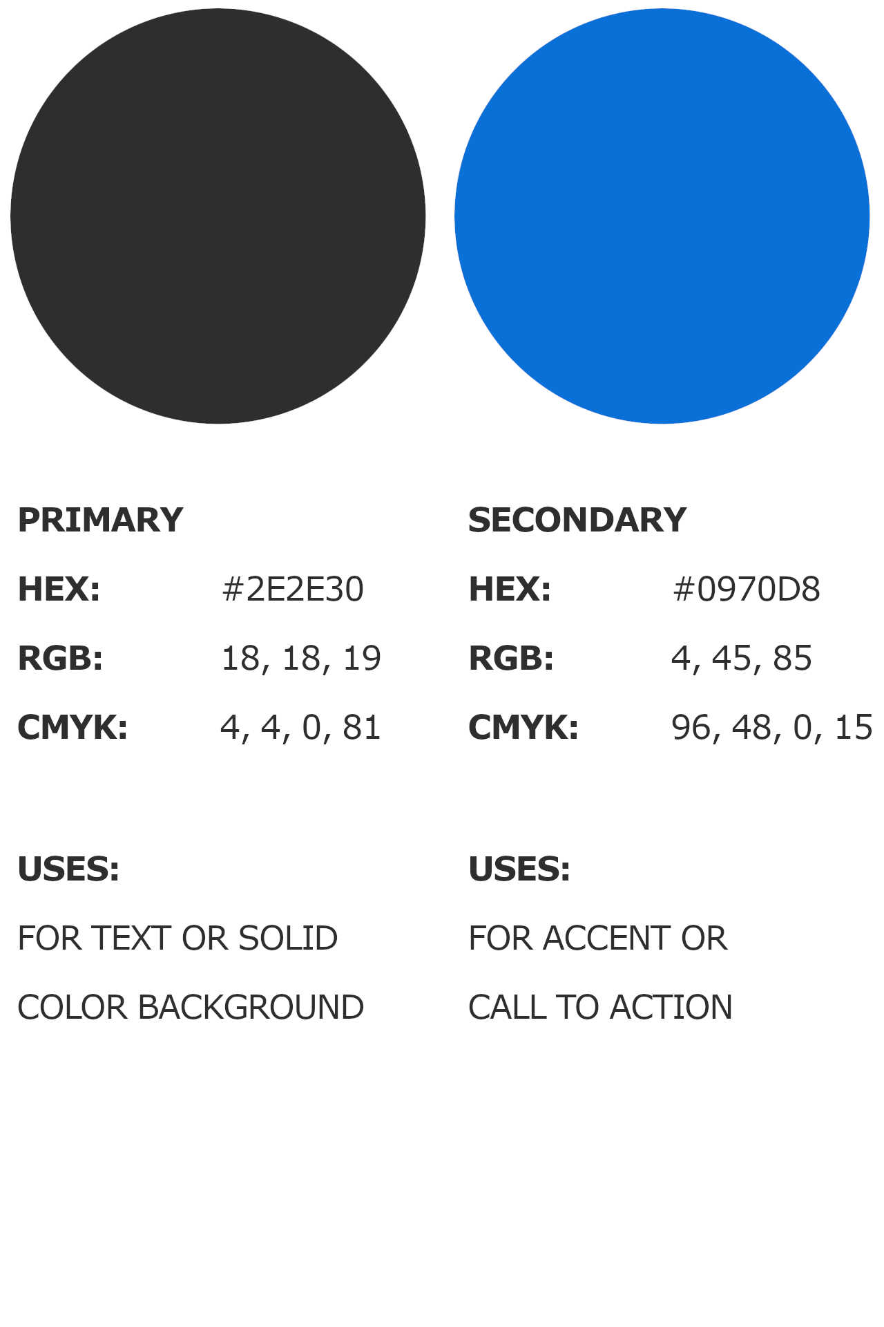
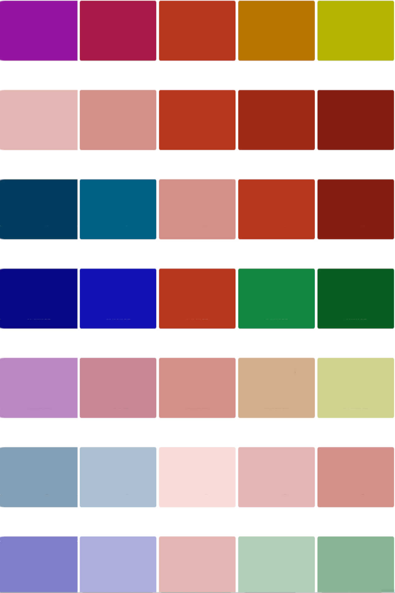
Understanding how colors affect perception allows designers to create more effective and meaningful visuals. By choosing colors that align with a brand’s message or a space’s intended mood, designers can create stronger connections with their audience.
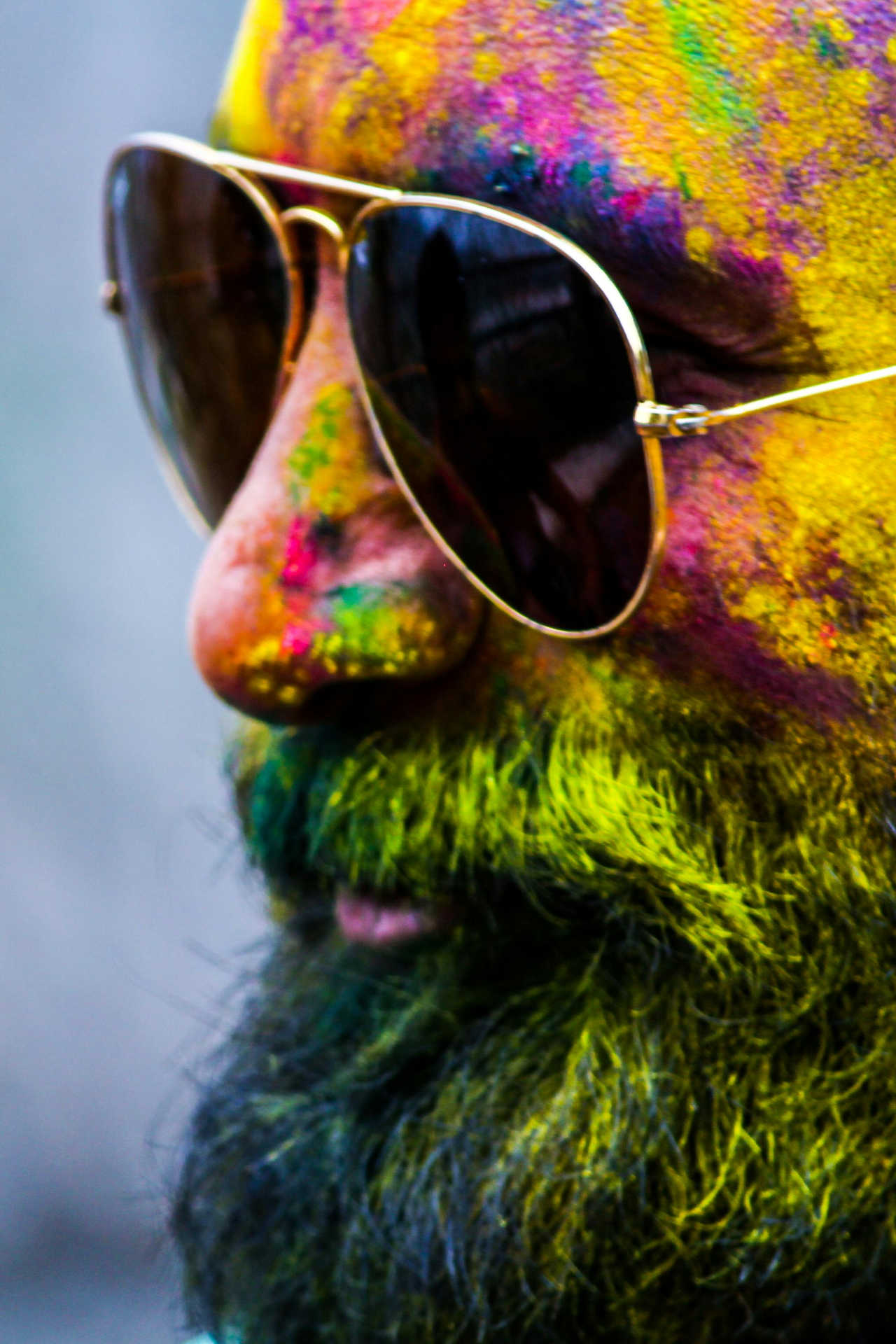
Colors evoke emotions and influence perception, making them a powerful tool in design.
— Paul Gauguin
Every successful color palette starts with a well-chosen base color. This primary hue sets the tone for the overall design, acting as the foundation for branding, interiors, fashion collections, and digital interfaces.
When selecting a base color, consider the following:
Many well-known brands have built their identities around a single dominant color:
Before finalizing a base color, test it across different materials and mediums. Compare how it appears on screens, in print, on fabric, or in an interior space under different lighting conditions.
Choosing the right base color ensures that your palette starts with a strong, meaningful foundation that resonates with your audience.
A well-chosen base color provides consistency and meaning across all design applications.
Once you've chosen a strong base color, it's time to build a full palette by selecting complementary and supporting colors. A well-balanced color scheme adds depth, flexibility, and versatility to your design.
There are several approaches to expanding a color palette:
Tools like Adobe Color ,
Coolors
,
and Material Design Palette
can help you explore and generate color combinations that complement your base color.
Whether you're designing for branding, interiors, fashion, or digital interfaces, expanding your palette thoughtfully ensures visual harmony and practical usability.
Explore different color harmonies to create a balanced and versatile palette. Tetradic colors shown above.
— Wassily Kandinsky
Color selection is not just about aesthetics—it plays a crucial role in readability, accessibility, and user experience. Whether designing a website, a product, or an interior space, ensuring inclusivity through thoughtful color choices is essential.
Poor contrast can make text difficult to read, especially for users with visual impairments. The Web Content Accessibility Guidelines (WCAG) recommend a contrast ratio of at least 4.5:1 for normal text and 3:1 for large text. High contrast ensures readability on screens, in print, and in environmental graphics.
Bright, highly saturated colors can be overwhelming and cause eye strain. In digital interfaces, reducing brightness slightly improves usability, while in interior spaces, muted tones create a more comfortable environment.
Color blindness affects approximately 8% of men and 0.5% of women worldwide, meaning not all users perceive colors the same way. Use texture, labels, and icons in addition to color to ensure important information remains clear. For example, in UI design, error messages should include an icon alongside red text.
Colors can look drastically different depending on the medium and lighting conditions. Test your palette on different screens, in printed materials, and under various lighting conditions to ensure it remains effective and legible.
Several tools can help verify that your colors meet accessibility standards:
Designing with accessibility in mind ensures your color palette works effectively for a broad audience while enhancing usability and inclusivity.
High contrast and colorblind-friendly palettes improve usability and inclusivity across all design fields.
A well-defined color system ensures that colors are used consistently across different mediums and applications. Whether you’re working on branding, web design, interior design, or product development, establishing a structured color hierarchy helps maintain a unified and professional look.
Organizing your color palette into categories allows for clear, intentional color usage. A structured palette typically includes:
Each color in your palette should have a defined purpose. In graphic design and branding, assign colors for headings, body text, backgrounds, and buttons. In interior design, define colors for walls, trim, furniture, and accents. Establishing clear guidelines prevents overuse or misapplication.
A brand style guide or design system ensures color consistency across all touchpoints. This document should include:
While consistency is key, allow for slight variations where needed. Different mediums may require color adjustments (e.g., brighter colors for digital screens, slightly muted tones for print). Adapt but remain true to the core palette.
A strong color system provides structure while allowing enough flexibility for creative application across multiple design disciplines.
A well-documented color system ensures consistent and effective color application across all design projects.
— Carl Gustaf Jung
A color palette may look great in theory but might not perform as expected in real-world scenarios. Testing your palette in different contexts ensures that your colors work effectively across all intended applications.
Before finalizing your color palette, create mockups or prototypes to see how the colors interact in a realistic setting. Whether it’s a branding kit, web UI, interior design rendering, or product prototype, testing early helps refine the palette.
If your design involves user interaction (such as websites, marketing materials, or product packaging), consider A/B testing different color variations to measure audience response and engagement.
Colors appear differently across digital screens, print materials, textiles, and physical spaces. Always test your palette in different lighting conditions and devices to ensure consistency.
Get input from colleagues, clients, and target audiences to determine if your color choices resonate as intended. Iterating based on feedback ensures your final palette is both aesthetically appealing and effective.
The more testing and refinement you do, the stronger and more adaptable your color palette will be for any design project.
Testing colors in real-world applications ensures consistency and effectiveness across different mediums.
Choosing the right colors can be overwhelming, but many powerful tools can assist in developing, refining, and testing your color palette. Below are some of the best resources for designers.
These tools allow you to experiment with different color schemes and find the perfect balance:
Ensure your colors meet accessibility standards for readability and usability:
For a deeper understanding of color theory and application, these books are highly recommended:
Using the right tools and resources can make the process of selecting and implementing colors much easier, ensuring your palette is both visually appealing and functionally effective.
Use online tools, accessibility checkers, and books to refine your color selection process. Coolers online color generator shown above.
Creating a well-balanced color palette is both an art and a science. Whether you're designing for branding, web interfaces, interior spaces, fashion collections, or product development, your choice of colors significantly impacts aesthetics, usability, and emotional appeal.
By understanding color psychology, selecting a strong base color, expanding with harmonious supporting colors, prioritizing accessibility and maintaining consistency through a structured system, you can create a palette that enhances both design and user experience.
Remember to test your colors in real-world applications, gather feedback, and refine your palette over time. With the right tools and strategic approach, you can craft a color scheme that is visually stunning, functional, and uniquely tailored to your project.
Ready to build your perfect color palette? Start experimenting today and bring your creative vision to life!
A strong, well-structured color palette enhances both creativity and functionality across all design fields.
We specialize in crafting cutting-edge UX/UI solutions that bring your digital products to life. Whether you're launching a new product, rebranding, or simply need a design refresh, we're here to help bring your vision to life. Send us a message today!