Posted on November 11, 2024, by Peter Loomis
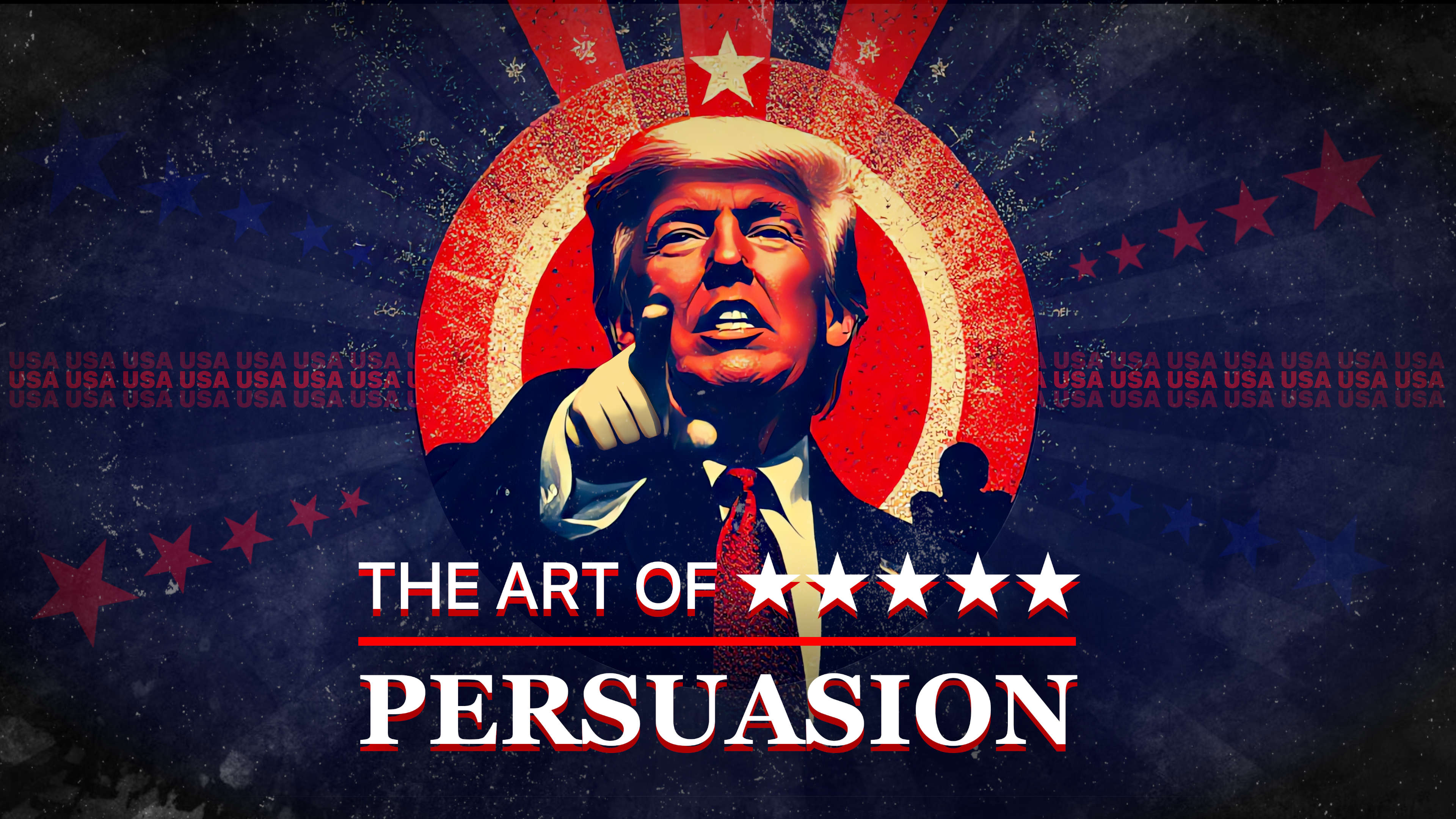
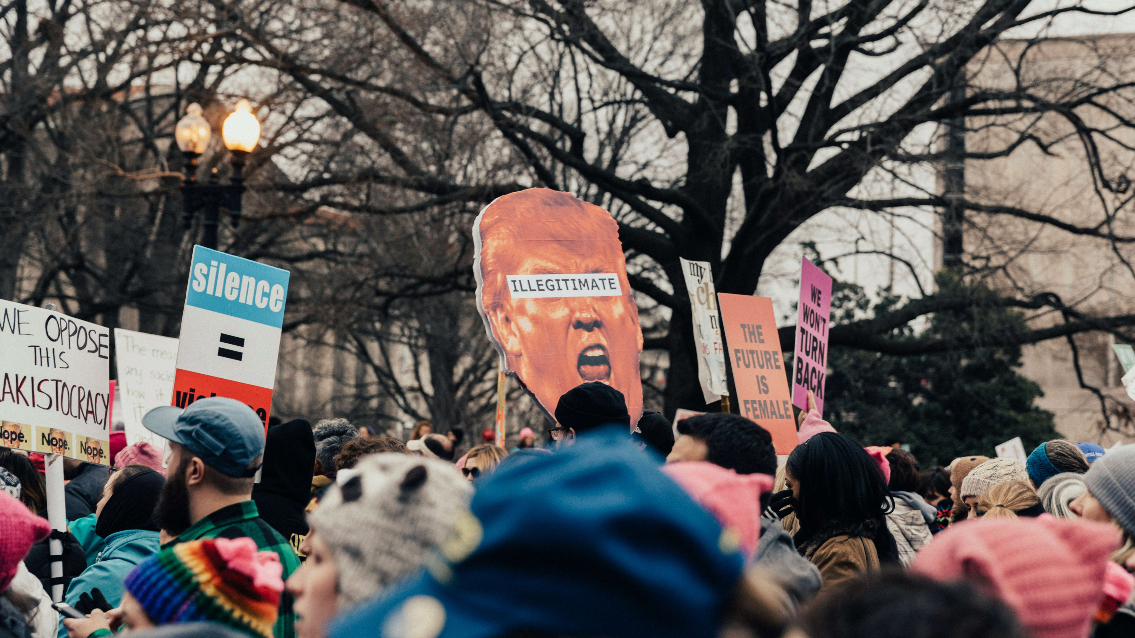
Think about the last political campaign that really made an impact on you. Chances are, it wasn’t just the words that resonated—it was the entire visual package: the colors, the fonts, the way it all just “felt right.” In politics, design isn’t an afterthought; it’s a key player in shaping public perception and building trust. Typography and color might seem like small details, but they’re the unsung heroes in the art of political persuasion, setting the stage for what voters feel about a candidate or movement, often before they even hear the message.
Today, let’s dive into the power of these visual choices in politics and why they work—or sometimes don’t.
Colors pack a psychological punch, and smart campaigns know this. Political designers choose colors not just to catch the eye but to subtly evoke emotions and convey values. Let’s break down a few of the most popular ones in politics:
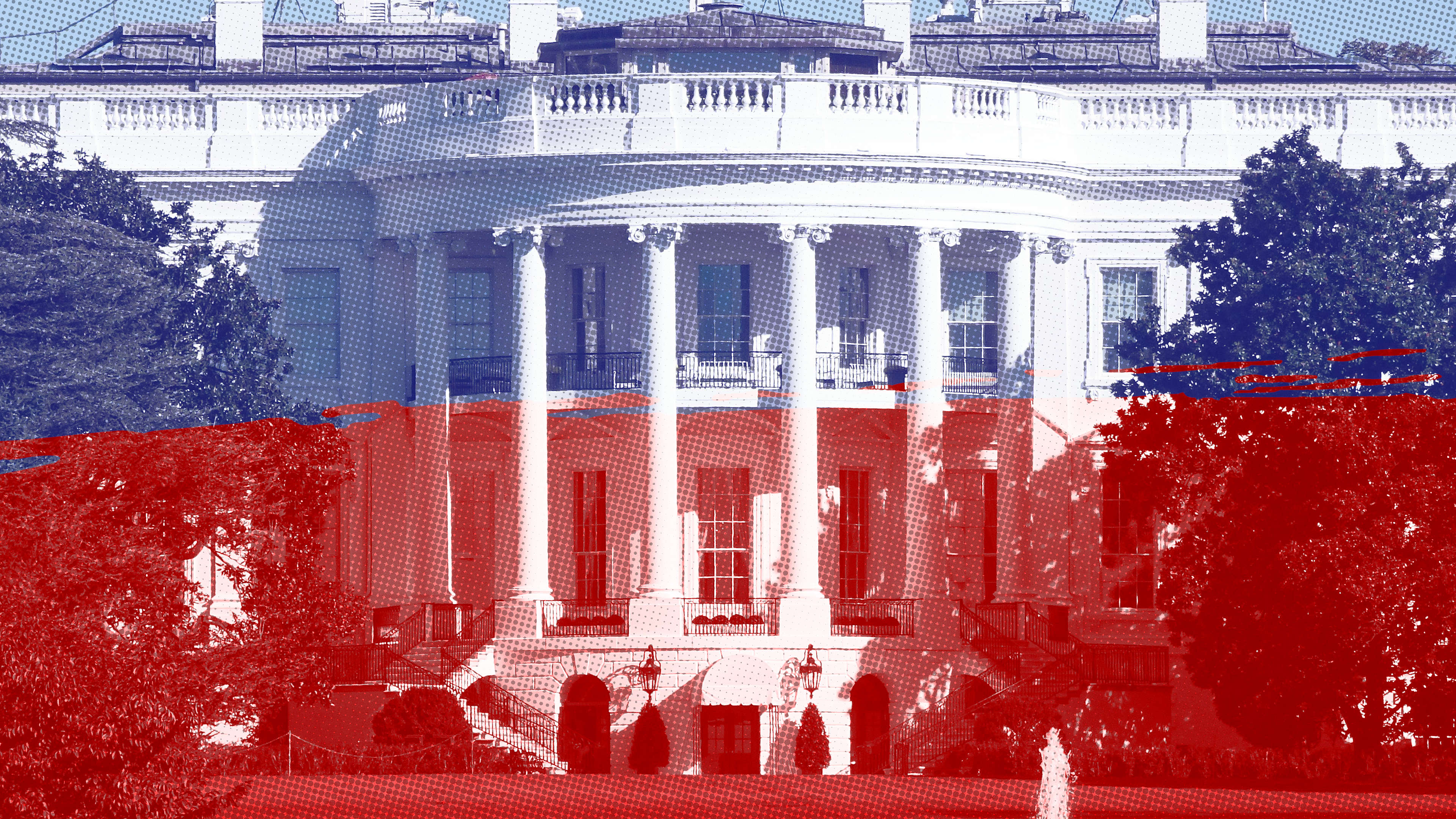
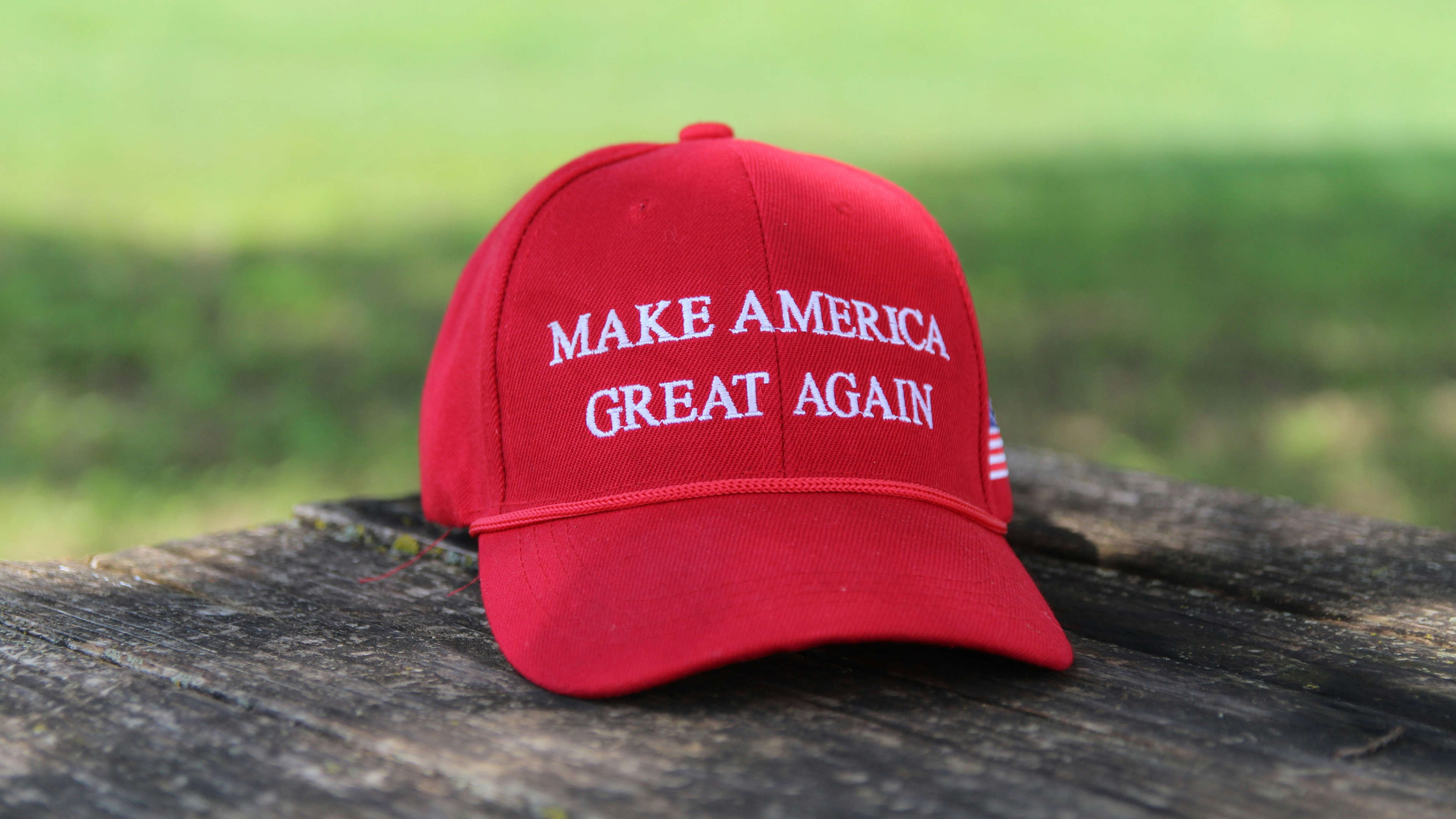
Take a look at political campaigns worldwide, and you’ll notice these colors in action. In the U.S., we see blue and red dominate, symbolizing stability and patriotism. In countries where red might traditionally signify communism, politicians lean into more neutral or fresh colors like blue, green, or even purple for a more universal appeal.
We’re starting to see more pastel and neutral tones, which can feel softer and more inclusive. Bright colors are on the rise, too, especially in social media where campaigns want to pop on a crowded feed. For example, campaigns targeting younger demographics may choose lively shades of yellow, teal, or coral to project energy and approachability.
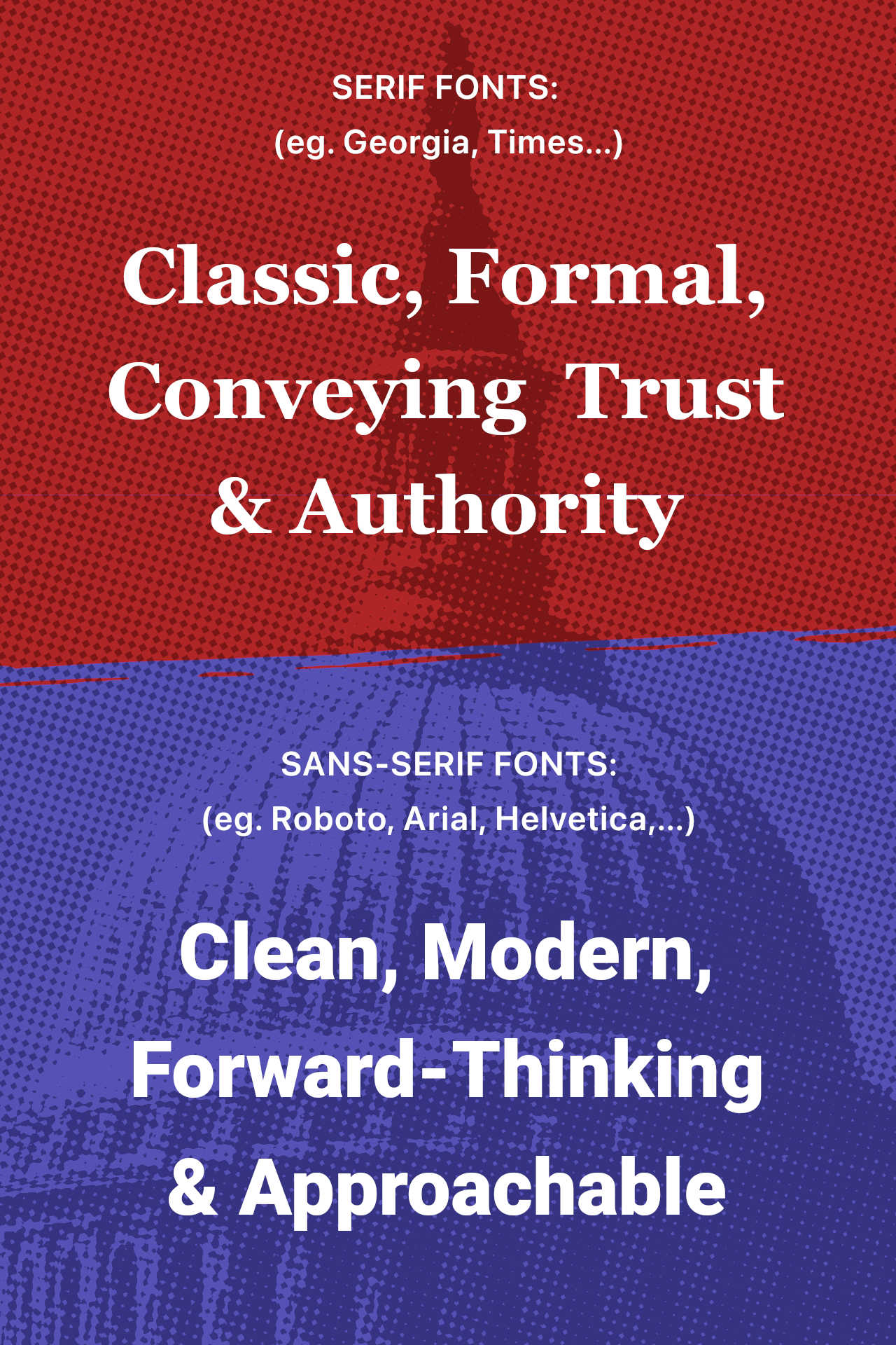
Just like colors, fonts have personalities. Imagine a serif font with classic details versus a clean, sans-serif font. The first feels timeless, reliable—like the font equivalent of a navy suit. The latter is modern, sleek, and perhaps a little edgy. Political campaigns often choose based on the vibe they want to project:
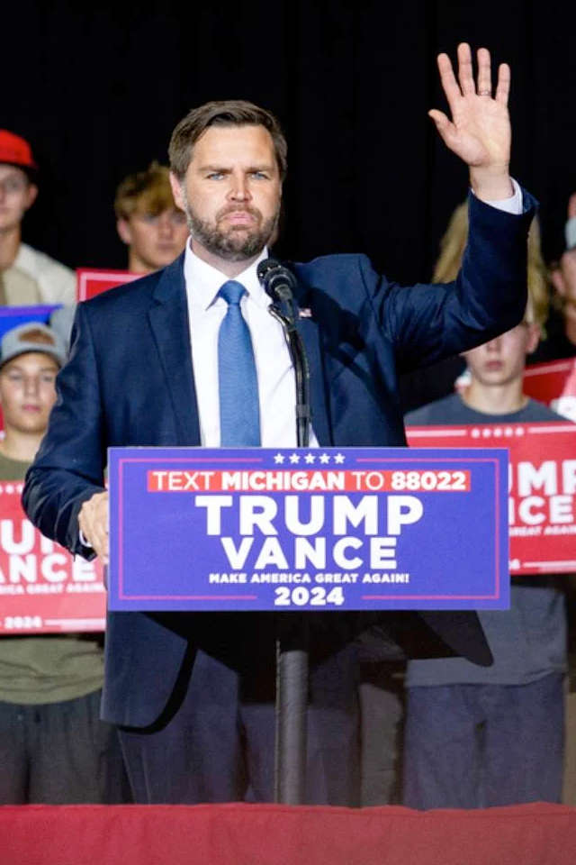
Heavy, bold fonts add urgency and importance. For instance, a “Donate Now” button in a bold font on a red background? You’re probably going to look twice. On the flip side, lighter fonts feel softer and less aggressive. Campaigns often use a mix of heavy and light fonts to create hierarchy, guiding viewers through important messages without overwhelming them.
One of the trickiest parts about choosing a font for a campaign is ensuring it translates across all media—TV, mobile devices, posters, social media ads, you name it. Designers need fonts that are both flexible and memorable, ones that can be bold for headlines but still readable for body text.
— Lauren I. Labrecque and George R. Milne
Pairing colors with the right fonts is a power move in politics. Picture a serif font in a stable, deep blue—classic and trustworthy, often chosen by established, mainstream campaigns. Now think of a sans-serif font paired with green—fresh, progressive, perfect for reformist or outsider candidates.
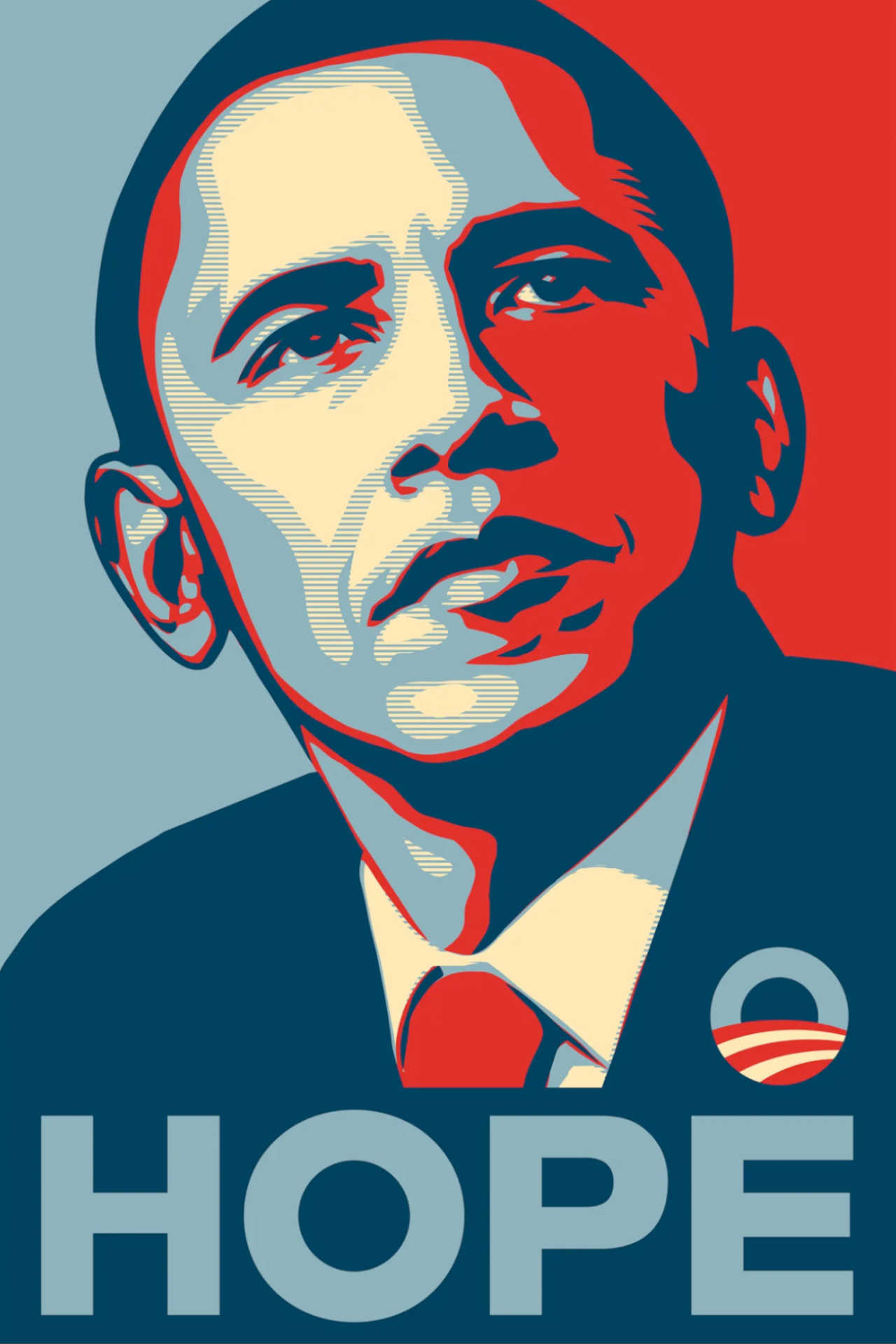
Let’s break down a few standout campaigns. Obama’s “Hope” campaign leaned into a clean, modern sans-serif font paired with blue and white, signaling optimism within stability. Bernie Sanders, on the other hand, used warm colors and approachable, friendly sans-serif fonts that spoke to grassroots values and inclusivity. These choices may seem subtle, but they hit emotional notes that resonate on a gut level.
While red can signify urgency, too much of it feels aggressive or even hostile. And complex or highly decorative fonts might look striking on a banner but become unreadable on smaller screens, alienating digital audiences.
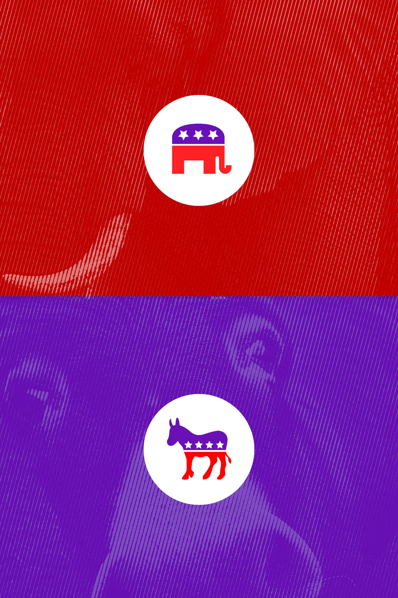
Political symbols, such as the Republican elephant and the Democratic donkey, are more than just mascots; they carry significant historical and emotional weight. These symbols have been ingrained in American political culture for over a century and play a crucial role in shaping public perception of each party.
The elephant symbol, popularized by political cartoonist Thomas Nast in the 19th century, has become synonymous with the Republican Party. The elephant's large size and strength convey the values of stability, authority, and resilience, key traits that the GOP has embraced in its platform. The elephant’s powerful image represents the party’s commitment to national strength and governance with a firm, steady hand.
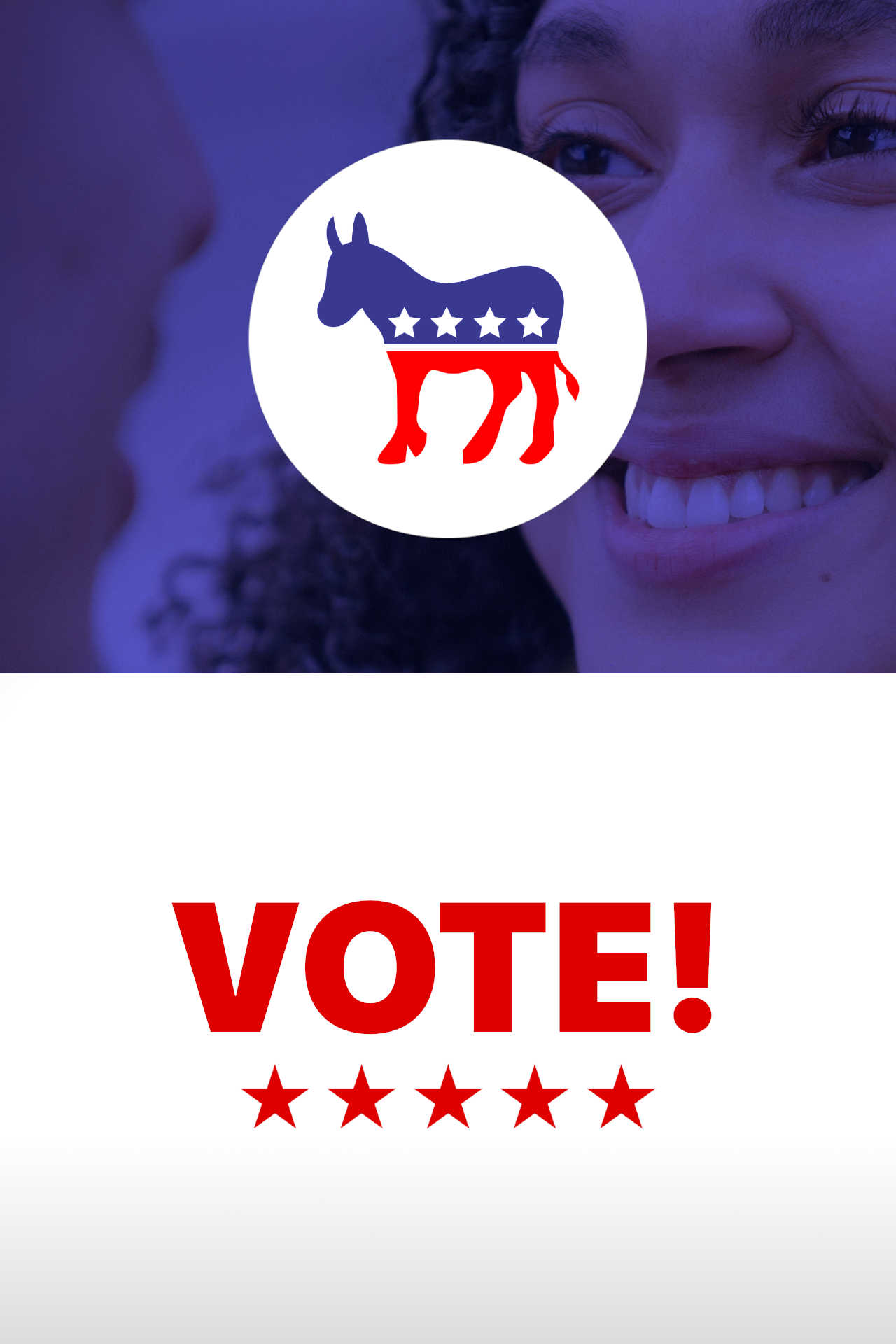
In contrast, the donkey has been the symbol of the Democratic Party since its use by Andrew Jackson in the 1820s. The donkey represents traits like humility, hard work, and determination. While not as visually striking as the elephant, the donkey speaks to the party’s focus on inclusivity, grassroots efforts, and a steady commitment to progress. The donkey's symbol is less about bold strength and more about perseverance and resilience.
Alongside these symbols, color plays a pivotal role in political branding. The Republican Party is often associated with the color red, which signifies urgency, strength, and patriotism, while the Democratic Party uses blue to symbolize trust, stability, and a calm vision of progress.
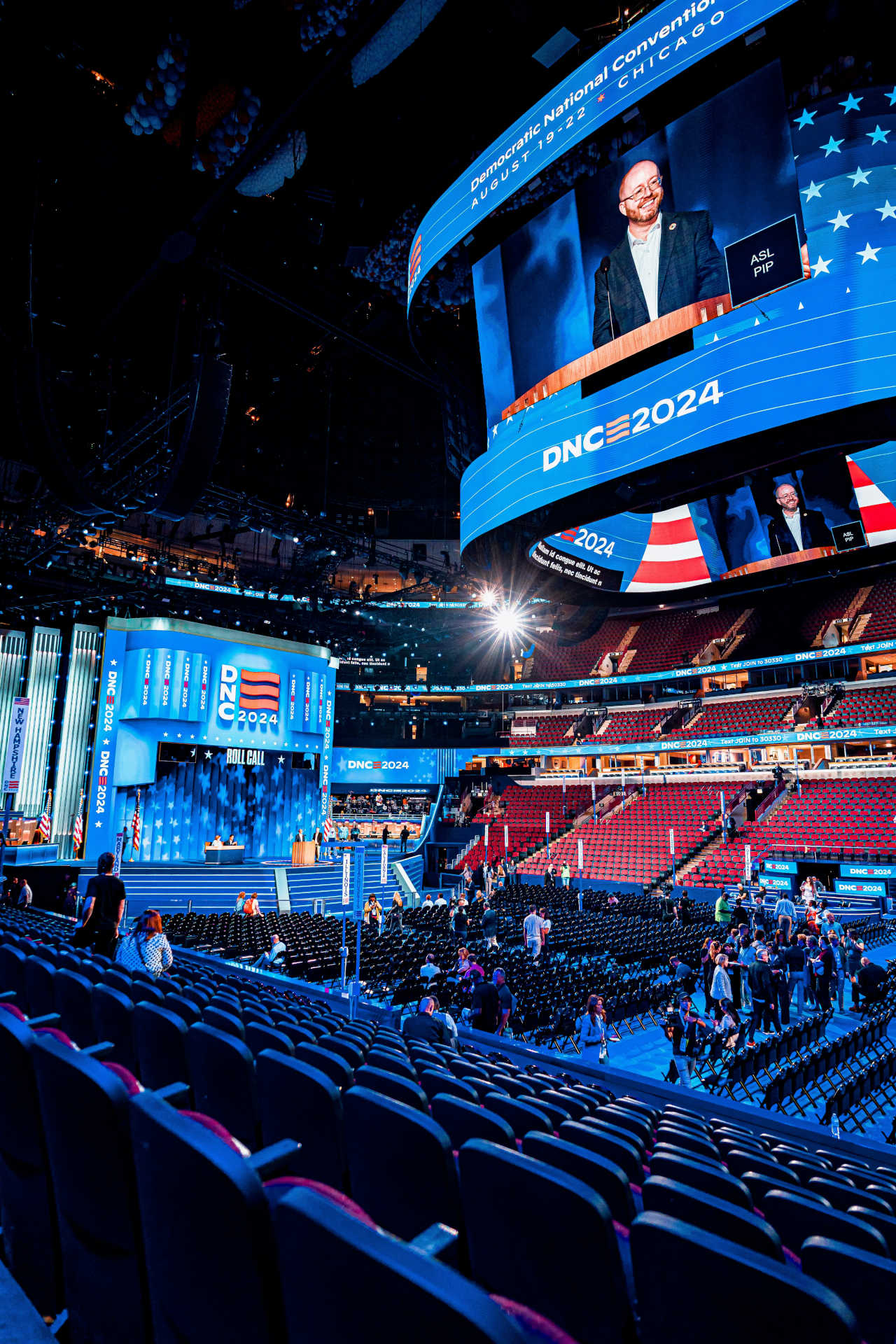
In terms of typography, Republicans tend to use classic, serif fonts, reinforcing the party’s connection to tradition and authority. These fonts are perceived as more formal and reliable, resonating with a sense of trust and longevity. In contrast, Democrats favor modern sans-serif fonts, which feel more approachable, progressive, and inclusive, aligning with their focus on change and new ideas.
Color isn’t universal, and political designers have to be mindful of these cultural nuances. For example, red in some countries might signal warning or communism, while in others, it’s tied to patriotism. The meaning of certain colors can change dramatically depending on the region or culture.
When campaigns go international, typography has to work overtime. Fonts that translate well across languages or support different alphabets are essential, and designers often have to adapt styles to accommodate these variations without losing the core message.
— Louis Cheskin
Ensure that every color and font choice aligns with the campaign’s values. Colors, typefaces, and layouts should all work together to reinforce trust and authenticity. Political design is not just about aesthetics; it’s about creating a visual language that reflects the campaign's core message.
Choose typography that feels relevant but also signals stability. Sans-serif fonts may be all the rage, but blending them with a classic serif in headers or slogans can appeal to a broader age range, conveying both modernity and trust.
Run A/B testing with sample groups to see which color schemes and typography choices resonate. Political design is all about connecting on an emotional level, and testing helps refine these choices before they hit the public.
At the end of the day, good political design isn’t just about what looks nice—it’s about what feels right. A campaign that nails its typography and color choices creates a brand that’s almost instantly recognizable and instinctively trusted. For designers in the political arena, the goal is to craft visuals that speak directly to the heart and mind, transforming complex ideas into feelings that move people.
Designers who understand the deeper layers of psychology, color theory, and typography are equipped to create campaigns that not only look good but resonate deeply. Whether or not we’re aware of it, the visual language of a campaign helps us decide who we trust, who we believe in, and ultimately, who we’ll vote for.
As we’ve seen, typography and color choices in political campaigns aren’t just superficial details—they’re key tools for shaping voter perception and influencing emotional responses. Thoughtful design can elevate a campaign, making it memorable, relatable, and trustworthy.
The intersection of art and politics has always been powerful, but today’s digital landscape gives designers an unprecedented opportunity to directly affect public opinion. By understanding the psychology of color and the impact of typography, political campaigns can craft messages that resonate deeply with voters on both a conscious and subconscious level.
In the end, the goal of any political campaign is to create a connection with voters. Through strategic use of design, campaigns can foster trust, communicate values, and motivate action—all with the power of color and type.
As a political designer, your role is critical in shaping these connections. Keep experimenting, testing, and refining your designs, always with an eye toward how you can evoke the emotions and responses that drive political change.
We specialize in crafting cutting-edge UX/UI solutions that bring your digital products to life. Whether you're launching a new product, rebranding, or simply need a design refresh, we're here to help bring your vision to life. Send us a message today!