BLOG


The Creative Process

From Concept to Design Execution

Posted on October 28, 2024, by Peter Loomis


Introduction

When it comes to design, there's a lot more going on behind the scenes than just making things look pretty. A solid design process is what really sets the stage for success. It’s like having a roadmap that takes you from a rough idea to a polished final product that not only looks great but actually works.

Over the years, I’ve fine-tuned my creative process to make sure each project is as efficient and effective as possible. Whether I’m working on a website, a mobile app, or a complete brand redesign, the steps I take stay pretty consistent. In this post, I’m going to break down my process so you can see how I go from concept to design execution, ensuring that every detail is covered along the way.

Let’s dive in!


1. Understanding the Client’s Needs

Before designing anything, first, get to know the client and their goals.

It’s not just about making something look good; it’s about creating a solution that really works for their business. When I start a project, the first thing I do is sit down with the client—whether that’s in person or virtually—and ask the right questions. Basically, an intake interview.

We talk about their brand, their audience, and what they hope to achieve with this project. Are they looking to boost conversions? Improve user engagement? Or maybe they need a fresh look to differentiate themselves from competitors. Understanding these objectives helps guide every design decision moving forward.

I also take a look at what their competitors are doing. This gives me a better sense of what’s out there and how we can create something unique that really stands out. At this point, we’re also defining how we’ll measure success—whether it's through KPIs like click-through rates, time spent on the site, or any other metric that matters to the client. Having these benchmarks in place is key to knowing when we’ve hit the mark.

It’s all about making sure that I’m solving the right problem from the start, so the final design is both beautiful and effective.

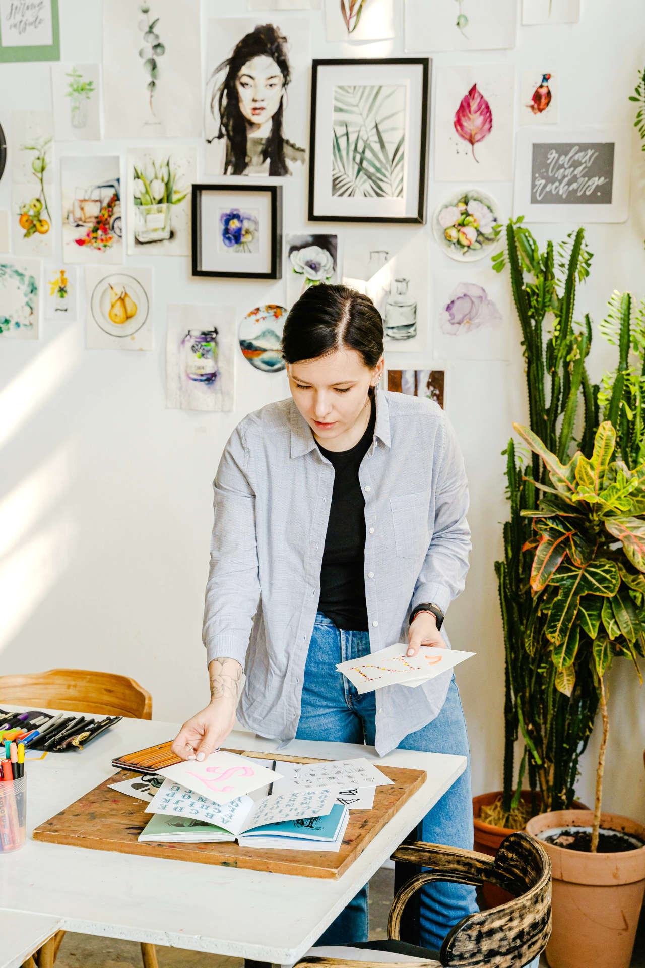
Woman sitting with laptop and swatches

2. Research and Ideation

This is where the creative gears really start turning.

Once I’ve got a clear picture of the client’s needs, it’s time to dive into research and start generating ideas. The first step is to dig deep into market and audience research. I want to understand who the end user is, what they’re looking for, and how we can design something that meets their needs while standing out in the market.

I’ll spend time looking at current trends in design and technology, but I’m also mindful of making sure the design has longevity. It’s important that what we create isn’t just trendy now but can evolve with the brand over time.

Then comes the ideation phase. This is where the magic happens! I’ll take everything I’ve learned from the research and start brainstorming creative solutions. It might involve sketching ideas, creating mood boards, or just jotting down concepts. Sometimes I work solo, and other times, I’ll collaborate with the client to bounce ideas off each other. The goal is to come up with a variety of directions we could take the design.

Inspiration is key during this phase, too. I’ll look at everything from modern art to other industries to spark new ideas. It’s not just about following what’s already out there—it’s about finding unique ways to push boundaries and create something fresh.

At this stage, I don’t hold back. It’s all about exploring as many ideas as possible before narrowing them down. Once I’ve gathered enough creative input, I’ll start refining those rough concepts into something that’s ready to be developed further.
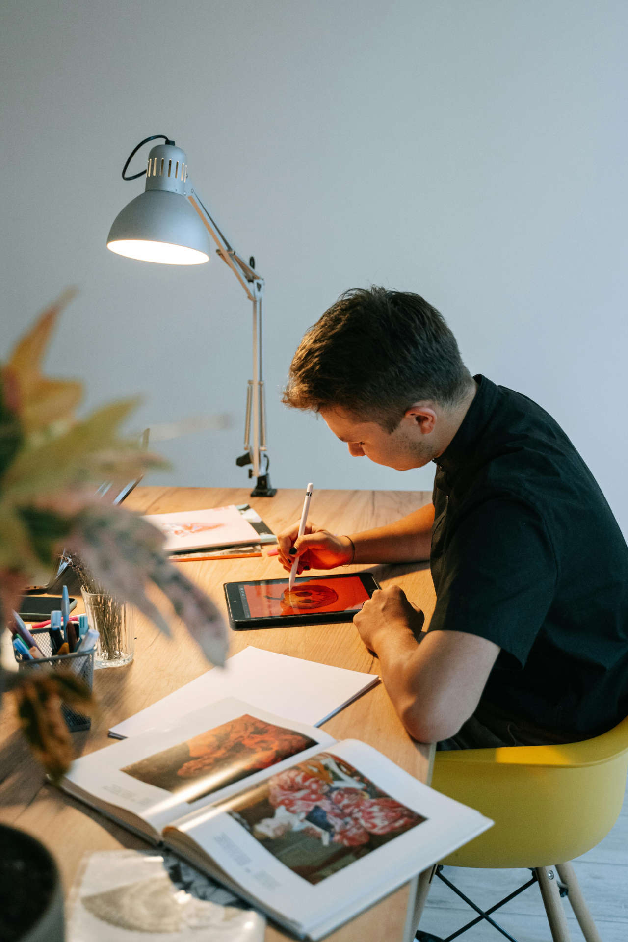
Man at Table With Tablet and Book

“Design can be art. Design can be aesthetics. Design is so simple, that's why it is so complicated."

— Paul Rand, Graphic Designer

3. Concept Development

This is where the creative vision really starts to take form.

Now that the ideas are flowing, it’s time to start shaping them into something more tangible. At this stage, I’ll begin by creating wireframes or simple sketches to map out the basic structure and layout. These wireframes are like the skeleton of the design—simple, no-frills blueprints that show where everything will go, from buttons and images to text blocks and navigation.

Wireframes are essential because they help both me and the client focus on functionality first, without getting distracted by the visuals just yet. I’ll usually create a few different versions so the client can see multiple approaches and give feedback on what’s working and what’s not.

User flow is another big part of this phase. I map out how users will move through the design, ensuring that the experience feels intuitive and smooth. This is where we figure out how the user will get from point A to point B with as few clicks as possible—whether they’re making a purchase, signing up for a newsletter, or just exploring the site.

Throughout concept development, I’m in constant communication with the client. We’ll review these wireframes and user flows together to make sure we’re aligned on how the final design will look and function. Feedback at this stage is crucial because it’s much easier to make adjustments now, before diving into the full visual design.

This phase is all about laying a strong foundation. Once the structure is solid and the client is happy with the direction, I’m ready to move on to the fun part—bringing the design to life with visuals, colors, and typography!

Woman at whiteboard

4. Visual Design

Now things start to get exciting.

Here we take the foundation we built in the wireframes and adding the creative elements that bring the design to life. The visual design phase is all about color, typography, imagery, and creating an aesthetic that not only looks good but serves the project’s goals.

First, I’ll establish a color palette that fits the brand’s identity and speaks to the emotions or actions we want users to experience. Colors play a big role in guiding user behavior, so I’m thoughtful about using them to highlight key areas like call-to-action buttons or important information.

Next comes typography. Choosing the right fonts is crucial for both readability and personality. I always aim for a balance—fonts that are visually appealing but also functional across different devices. It’s not just about picking a cool font; it’s about finding something that aligns with the brand voice and enhances the overall user experience.

Once I have the colors and typography nailed down, I move on to the UI components—the buttons, icons, forms, and other elements that users interact with. Each of these pieces is designed to be both visually appealing and easy to use. It’s about creating a seamless, enjoyable experience where everything feels intuitive.

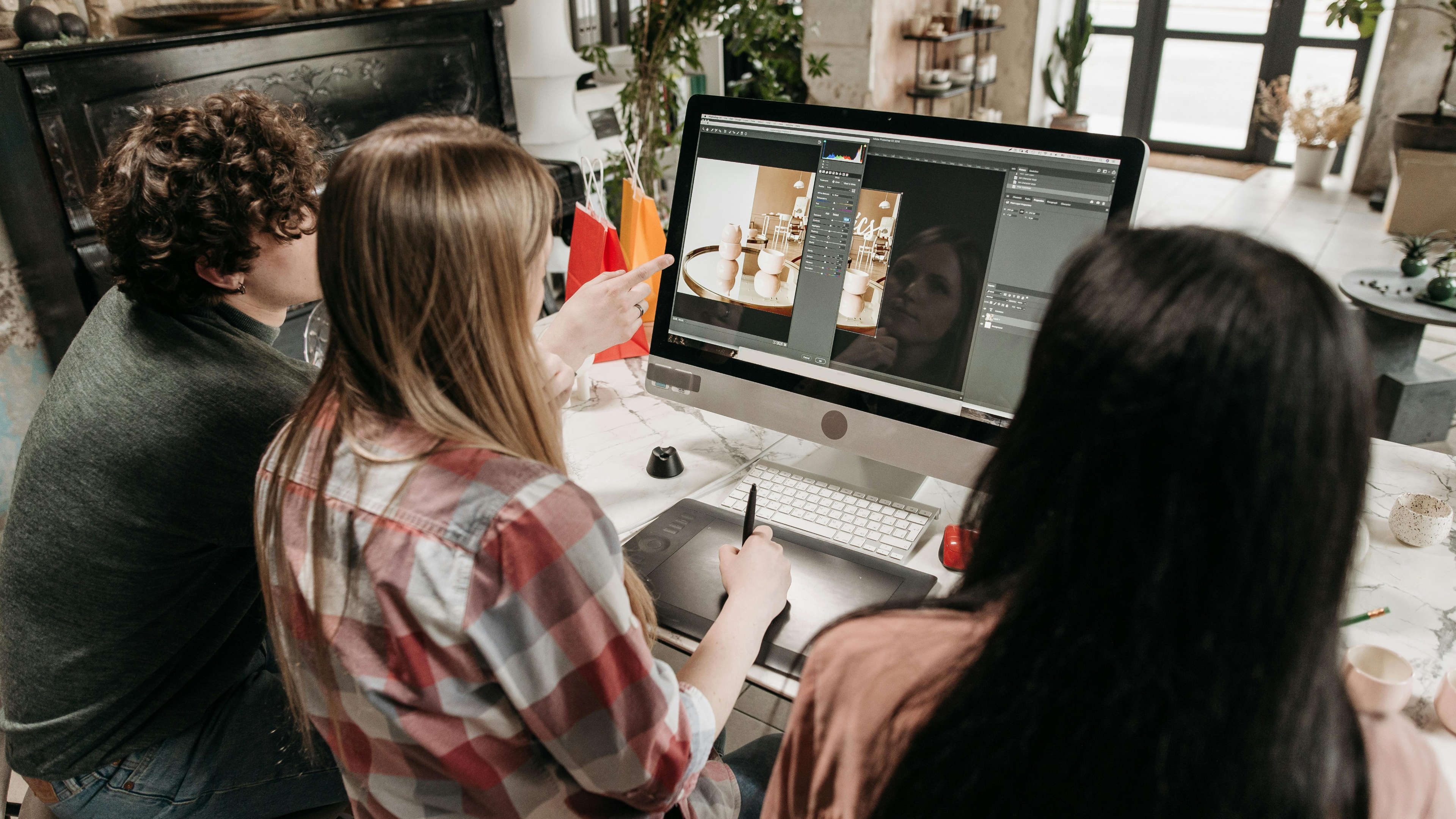
At this stage, I create high-fidelity mockups, which are essentially detailed visual representations of the final design. These mockups give the client a clear view of what the final product will look like, complete with colors, fonts, and all the visual details. This is when the design really starts to shine.

Throughout this phase, I’m continually checking in with the client, making sure the design aligns with their vision and objectives. We tweak and refine until everything looks just right. Once the visuals are approved, we’re ready to move on to prototyping and testing!

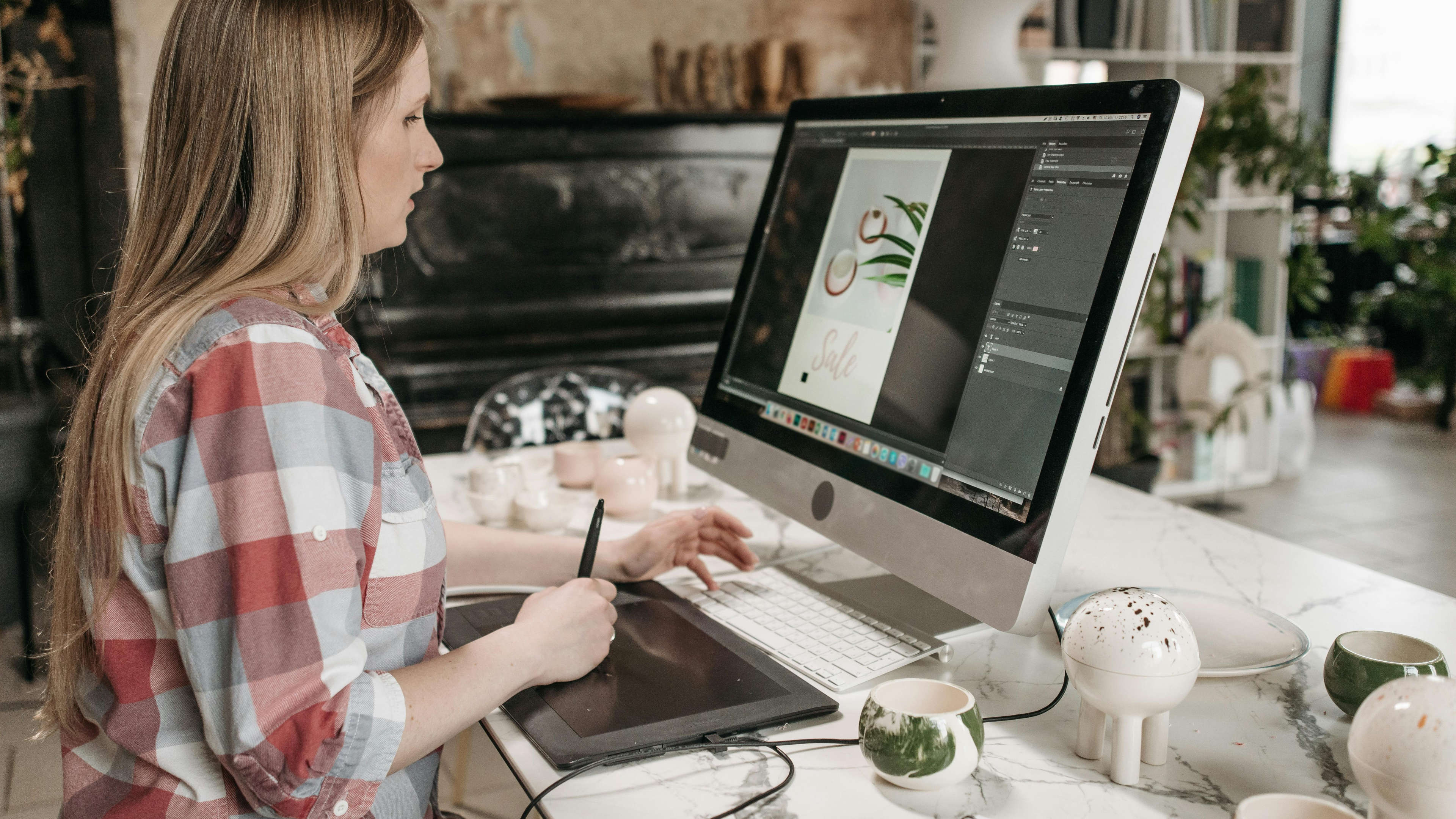
Designer at Work


5. Prototyping and Testing

With the visual design locked in, it’s time to take things a step further.

Prototyping is where the design moves from static mockups to something users can actually engage with. This step is crucial because it lets both the client and real users experience the design in action before it goes live.

I use prototyping tools to build interactive versions of the design, simulating how users will navigate and interact with the final product. This is especially useful for testing things like user flow, functionality, and overall ease of use. Clients love seeing their vision come to life at this stage because it feels like a nearly finished product, even though we still have room for adjustments.

User testing is a big part of this phase. I’ll gather feedback from real users, watching how they interact with the design and noting any pain points or areas of confusion. Sometimes what looks great on paper doesn’t always translate perfectly in practice, and that’s okay—this is exactly why we test!

Based on user feedback, I’ll make tweaks and improvements to the design. This could involve refining the navigation, adjusting visual elements, or rethinking certain interactions to ensure everything works smoothly. The goal is to make sure the design is not only beautiful but also functional and user-friendly.

This phase is all about iteration—testing, learning, and improving. Once we’ve ironed out any issues and the design passes user testing with flying colors, we’re ready to move into the final stretch: execution and handoff to developers!

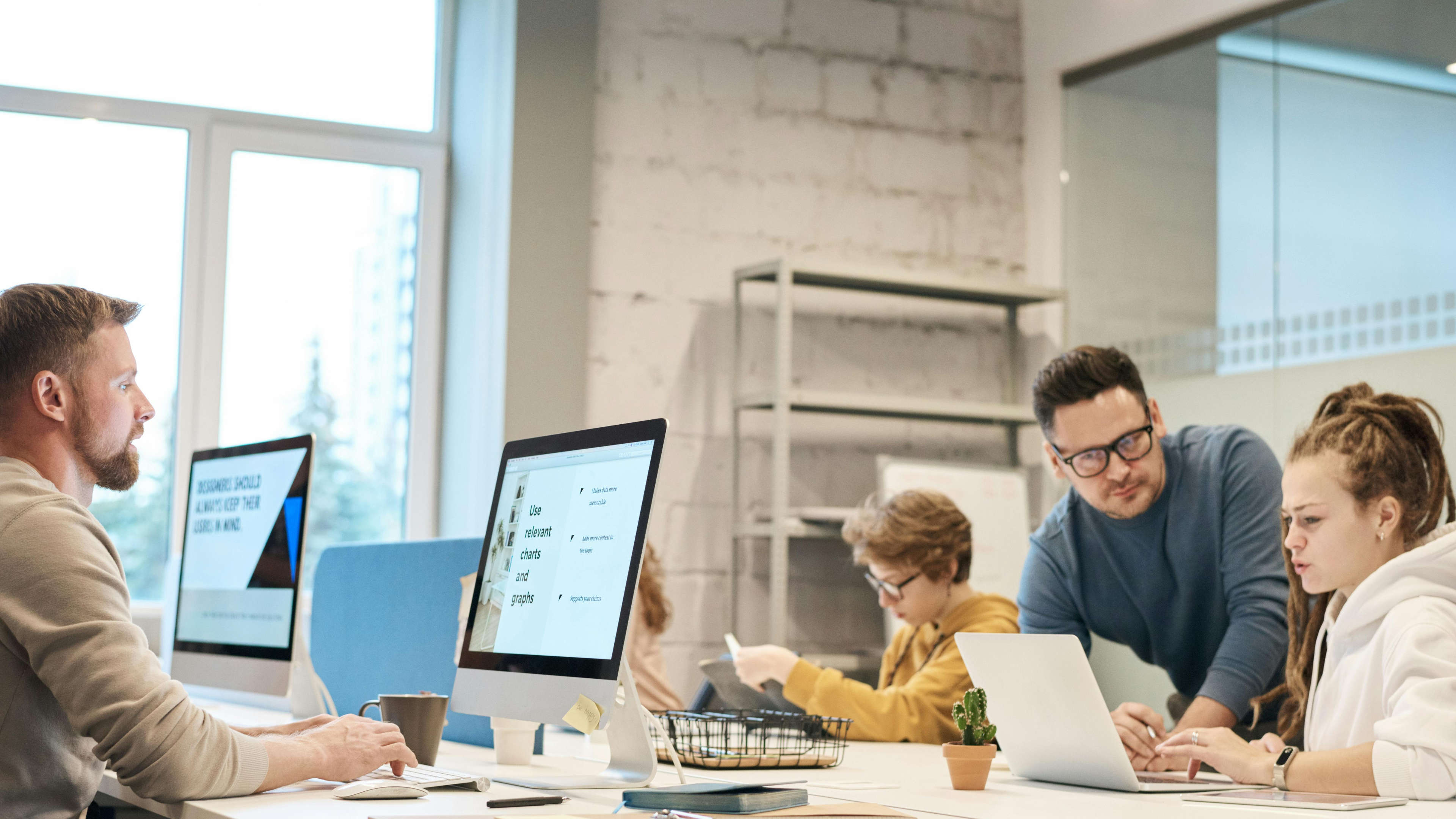
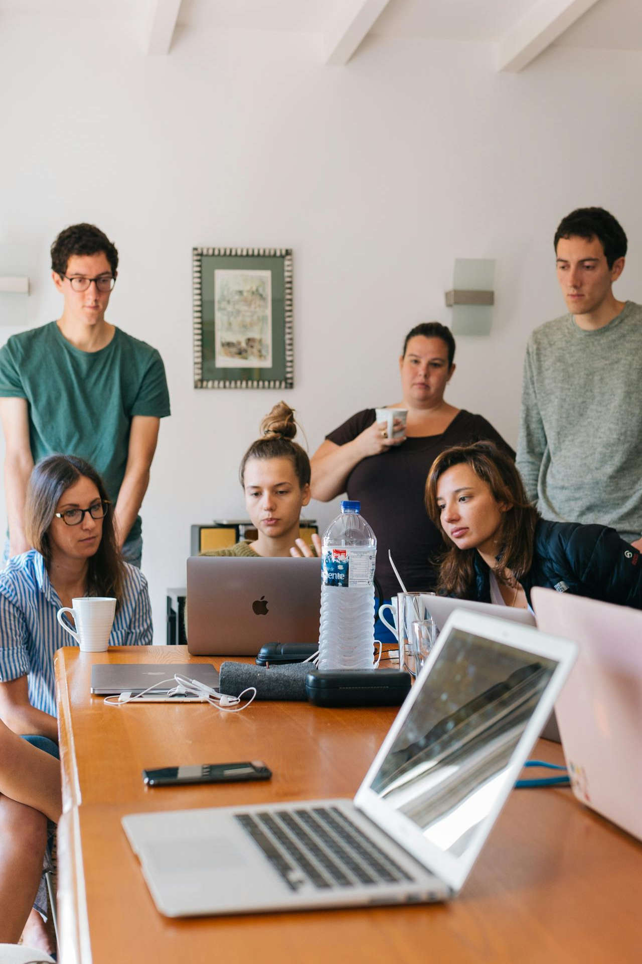
Team Review at Computer


6. Design Execution and Handoff

This is about making sure the vision is brought to life exactly as intended.

Now that the design has been tested and refined, it’s time to execute the final steps and hand everything off to the development team.

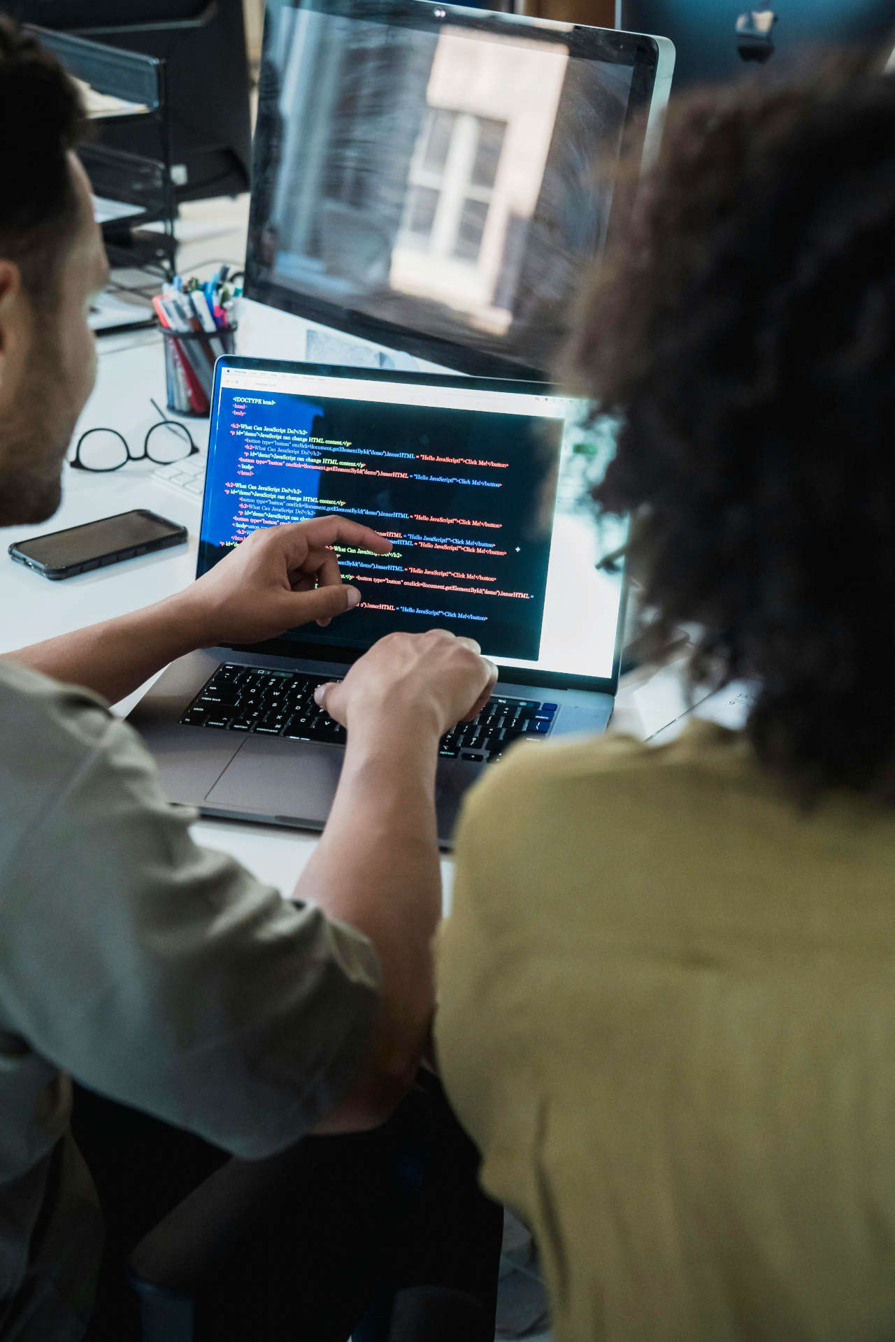
First, I’ll finalize the design files, ensuring every detail is polished and pixel-perfect. This includes all the visual assets—icons, images, typography choices, and any animations or transitions we’ve planned. Everything is organized neatly so that the developers have what they need to translate the design into a fully functioning product.

I also provide a detailed style guide or design system. This is like a blueprint that includes guidelines for colors, typography, spacing, and how different UI elements should behave across the site or app. It ensures consistency throughout the development process and makes it easier for the team to implement the design exactly as we envisioned it.

Communication with the developers is key here. I make sure to stay available for any questions or clarifications they might have during the build phase. Sometimes things need slight adjustments to work better in the final product, and I’m always there to collaborate and make sure we stay true to the design’s core principles.

Once the product is built, I’ll also do a final review to ensure everything aligns with the original design. If any tweaks are needed, I work with the developers to get them done quickly and smoothly.

At this point, the project is nearly complete! The design is live, and the final handoff ensures a smooth transition from concept to reality, with everything in place to make the product shine.

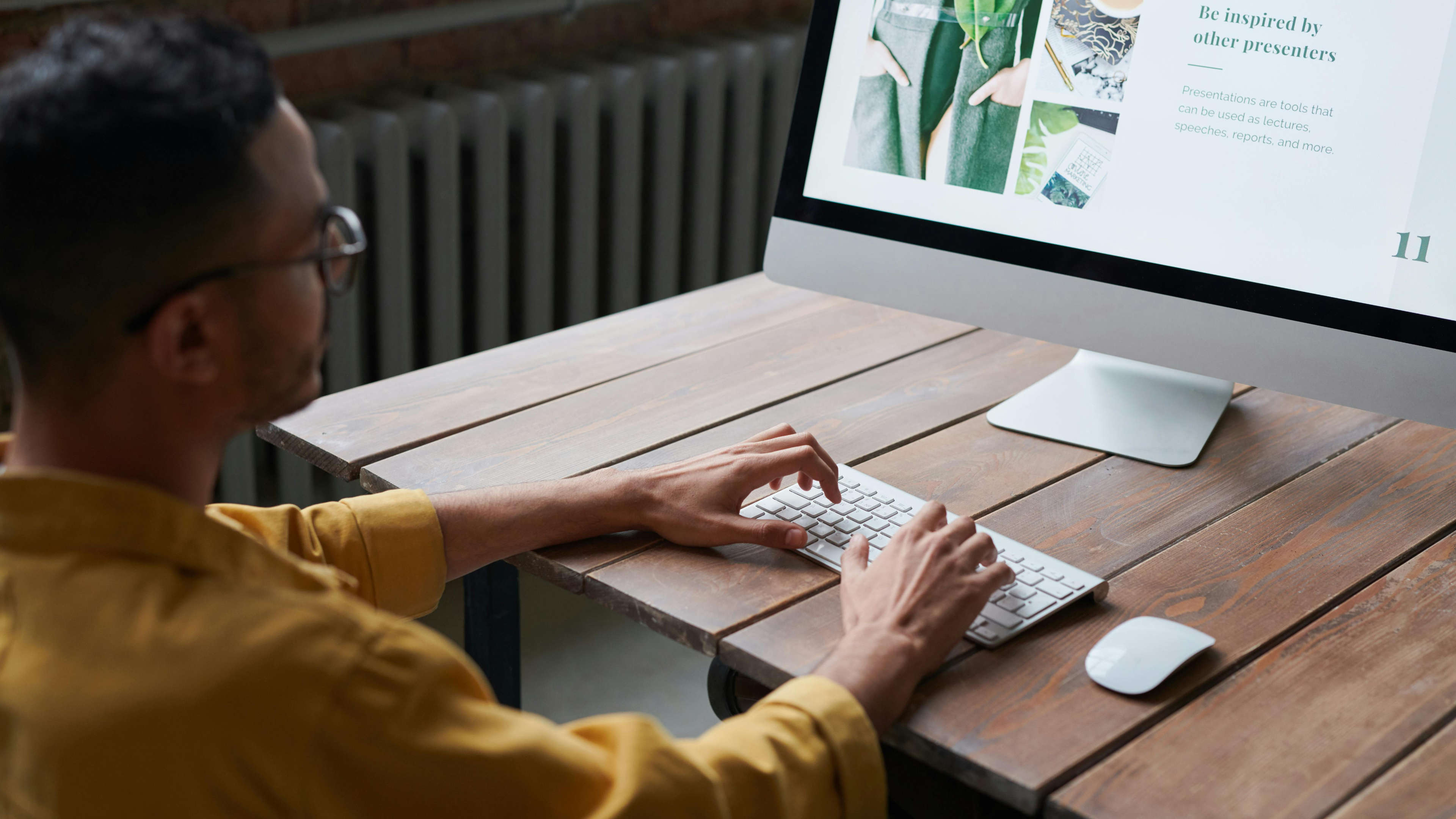
Man on Computer at Long Table


7. Production & Quality Assurance

Production is an essential part of a project that deserves its own spotlight.

Production is a critical phase that can significantly influence the final outcome of any project, especially those involving development. While we might explore the intricacies of the production process in a future post, let’s cover the basics for now.

Once all the design assets are prepared and handed over, the focus shifts more towards the development side. But don’t worry—it doesn’t mean the design team steps away entirely. Depending on the client, budget, and production team, there’s often a lot of collaboration and oversight involved.

Asset Preparation and Transfer: First up, we ensure that all assets are properly prepared and transferred to the production team. This includes organizing files, formats, and ensuring everything is ready for the next steps.

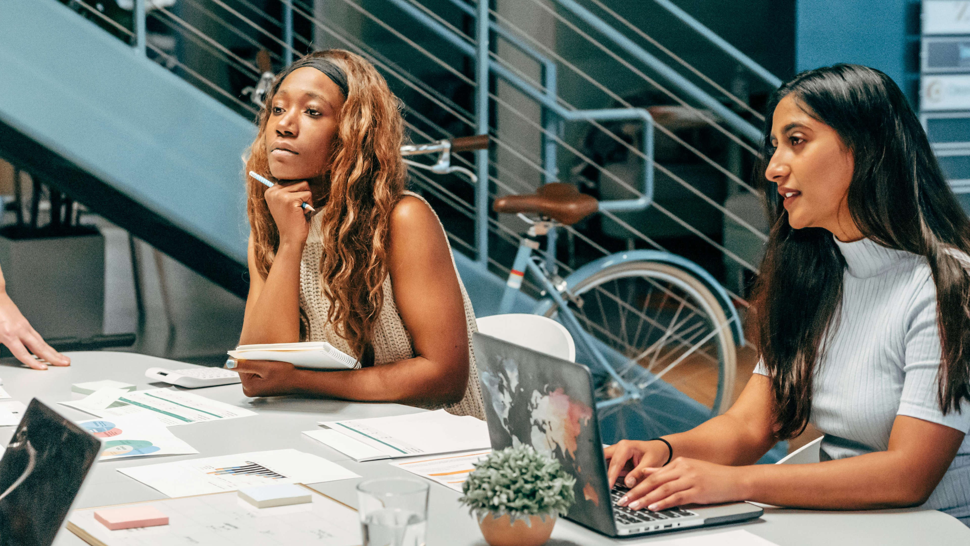
Detailed Review with the Production Team: We then sit down with the production team to go over every detail. It’s crucial that they understand exactly what we aim to achieve with the buildout. This means sharing detailed diagrams, notes, specifications, and any other relevant information. Whether it’s animations, video specs, or the content like text and images, we make sure nothing is left out.

Comprehensive Documentation: Providing thorough documentation helps streamline the handoff process. The more detailed and organized our specifications are, the smoother the transition into production. This minimizes misunderstandings and ensures that the production team can implement the design as envisioned.

Quality Assurance (QA): QA plays a vital role throughout the production phase. If we’re handling the production in-house, we maintain an ongoing internal QA process to catch any issues early. If the production is managed externally, QA becomes part of the client’s review process. This typically involves multiple rounds of feedback and revisions to ensure everything meets the high standards we set.

By keeping communication clear and maintaining a strong focus on quality at every step, we make sure that the production phase not only brings the design to life but also upholds the integrity and goals of the project.

Production Process

8. Post-Launch Support

Just because the design is live doesn’t mean the work is done.

Post-launch support is a crucial phase where I make sure everything continues to run smoothly and meets the project’s goals. After all, a great design is about more than just the launch—it’s about ongoing success.

Once the product is live, I monitor its performance closely. This can include tracking user behavior, reviewing analytics, and checking key performance indicators (KPIs) like conversion rates, user engagement, and bounce rates. By keeping an eye on these metrics, I can see how the design is performing in the real world and whether it’s hitting the targets we set during the planning phase.

During this time, I’m also available to make any necessary adjustments. Sometimes, small tweaks are needed after launch to optimize the user experience further. Maybe a button isn’t getting as many clicks as expected, or a piece of content needs to be rearranged to better capture attention. Whatever the case, I’m here to fine-tune the design to ensure it’s delivering the best results possible.

I also provide long-term support if needed, helping clients with future updates, new features, or even full redesigns down the line. The digital world is always evolving, and I like to make sure that my designs evolve with it.

In the end, post-launch support is about making sure the project continues to succeed and that the design grows and adapts along with the business’s needs. By staying involved, I help clients maintain a high-quality user experience that keeps their customers coming back.

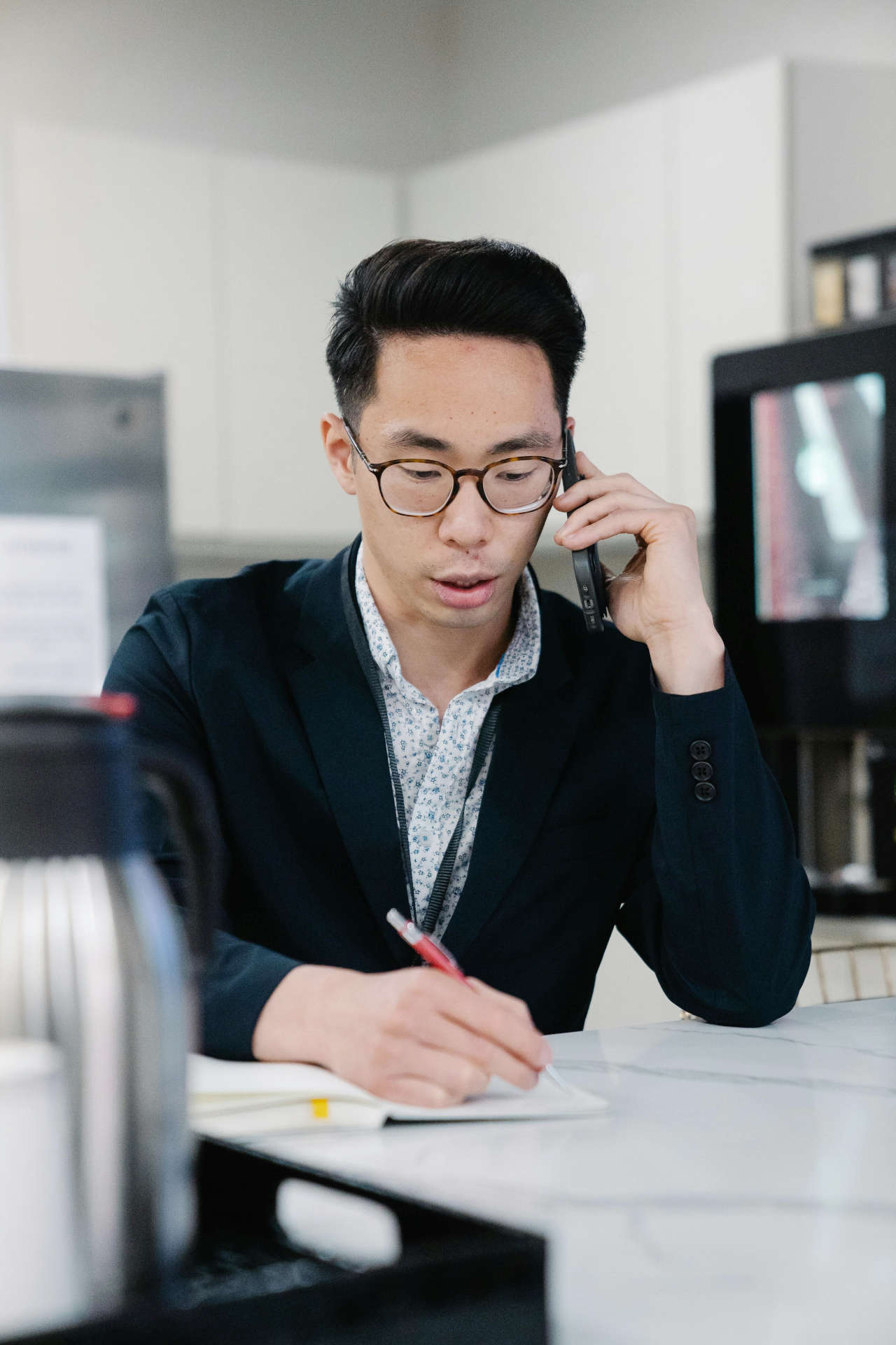
Man On Cellphone Writing


Conclusion

The creative process is more than just a series of steps—it’s a journey that transforms an idea into a fully realized design, one that meets both the client’s goals and the users’ needs. From the initial conversations to post-launch support, each phase plays a crucial role in ensuring the final product not only looks great but also functions smoothly and delivers real results.

By following a structured approach that includes research, concept development, visual design, prototyping, and execution, I ensure that every detail is thoughtfully considered. It’s this attention to both the big picture and the small details that makes the difference between a good design and a truly exceptional one.

So whether it’s a website, app, or brand identity, my process guarantees that each project is handled with care, creativity, and a commitment to quality. And while the tools and technologies may change, my goal always remains the same: to create designs that not only look great but also work hard for the businesses behind them.

Ready to bring your next project to life? Let’s start the conversation!

Man Shaking Hands


Stay Connected

Follow us on Facebook, Instagram, LinkedIn, X and YouTube for more updates, behind the scenes content and design inspiration!


Ready to Elevate Your User Experience? Let's Collaborate!

We specialize in crafting cutting-edge UX/UI solutions that bring your digital products to life. Whether you're launching a new product, rebranding, or simply need a design refresh, we're here to help bring your vision to life. Send us a message or sign up for updates.


Contact Us